Why this one section quietly decides trust, scroll, and direct bookings
Summary: Above-the-fold plays a decisive role in hotel websites because most users arrive with low trust and high intent. Unlike well-known brands, smaller hotels must quickly establish credibility through clear visuals, a strong headline, and immediate booking cues. This section acts as a quick evaluation zone where users check relevance, pricing, availability, and overall vibe before deciding to scroll. Poor hierarchy, missing context, or too many choices create confusion and increase bounce rates. Elements like ratings, location clarity, and authentic imagery help build instant confidence. When designed well, above-the-fold earns the scroll and gives the rest of the website a chance to convert.
In this article
Research context
As part of my research on improving direct bookings for hotels, I have been studying numerous hotel websites closely.
Before joining Portico Webworks, I worked on user experience for mobile applications. In mobile apps, I never really felt the need to optimize the above-the-fold. Users download an app with intent. They are already committed and willing to explore.
Before this phase of my work, I had never consciously observed hotel websites from a UX point of view. That changed when I started designing a hotel website for a brand. To design better, I began studying how different hotels handle their above-the-fold.
To understand patterns, I randomly looked at more than 30 hotel websites.
Some of them made me pause. I remember thinking, wow, this is a very well known and popular hotel brand, but why does the website feel like this. I even questioned whether people book hotels even if the website experience is not great, simply because the brand is famous.
Then the realization hit me.
Popular hotel brands can afford weak or broken website experiences because trust already exists outside the website. But that luxury does not apply to hotels that are not well known. For them, the website has to work harder. It has to build trust quickly.
First impressions on above-the-fold
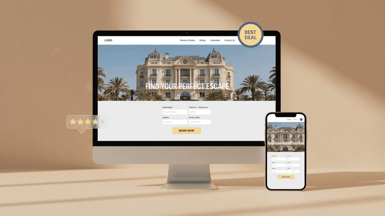
When I land on a hotel website, my eyes almost always go straight to the centre of the above-the-fold. If the visual is strong and there is a heading that catches my attention, I instinctively feel like scrolling to check whether this hotel is actually good. This could be a still image, an animation, a video, or a simple image slider.
In hospitality, if the vibe through visuals and the utility through location clarity, pricing cues, or a visible booking bar are not immediate, bounce rates spike.
Another behavior I consistently noticed is how users treat the above-the-fold as a quick check zone. Sometimes I am not ready to book. I just want to see if rooms are available on my desired dates or get a sense of pricing. If that utility is hidden or requires extra clicks, it feels like unnecessary effort.
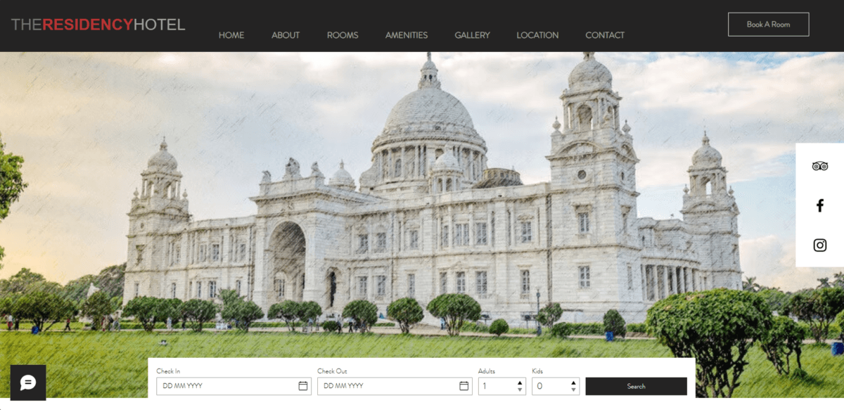
While analysing websites, I came across one homepage that clearly showed how things can go wrong above-the-fold.
Case study: what went wrong
Missing headline
When I landed on the page, the first thing I noticed was that the headline was missing entirely. There was no clear message telling me what kind of hotel this is or where it is located. As a visitor, I genuinely did not know whether this was a heritage stay, a business hotel, or a city reso
Confusing visuals
The visual made the confusion worse. The hero image showed a famous monument instead of the hotel itself. It sold the destination, not the stay. I could not imagine the rooms, the atmosphere, or what it would feel like to actually stay there.
Overloaded interface
Then came the interface. Navigation links, social media icons, a floating chat button, and a large booking bar were all present at the same time. Everything competed for attention. Nothing clearly guided my eyes toward the next step. There was no visual hierarchy.
This is where basic UX principles become very real. Miller’s Law tells us that the human brain can handle only around seven items at a time. When too many elements appear above-the-fold, users feel overwhelmed without knowing exactly why.
Lack of trust and clarity
I also noticed that there was no trust or reassurance built into the context. No visible location cue. No rating. No supporting line to orient the guest. The website asked me to interact before helping me feel confident.
This pattern showed up across several sites.
The power of ratings, location, and social proof
Ratings also play a huge role. When ratings are visible above-the-fold, there is an instant reaction. This place must be nice. Let me look more. Even a good looking website feels incomplete when social proof is missing.
In some websites, I had moments where I genuinely questioned whether the image shown was even the hotel. That alone break trust.
Location clarity is another small but powerful detail. If the exact location is visible upfront, I can quickly check distances on Google without wasting time trying to find where the hotel actually is.
Decision making and button overload
I also noticed how decision making slows down when too many actions are presented. Multiple buttons like book now, check availability, and view rooms compete with each other. Hick Hyman Law explains this clearly. The more choices we give users, the longer it takes for them to decide.
My own behavior is simple. I usually discover hotels on booking platforms first. Then I visit the hotel website to check whether it feels trustworthy and worth booking directly. If the above-the-fold gives me confidence, I scroll further. If it does not, I leave.
Key takeaways: designing above-the-fold
This is why above-the-fold should be simple, professional, and intentional. A clear heading. Visuals that represent the actual property. Limited navigation. One clear primary action. Balanced use of brand colors that do not overpower the experience.
The fold does not stop the scroll. It earns the scroll.
In most cases, users decide whether to trust a hotel within the first few seconds. When above-the-fold builds clarity and confidence, the rest of the website finally gets the chance to do its job.