When a guest lands on your hotel website, they are not just browsing rooms. They are making a decision that involves money, safety, comfort, and expectations. Unlike buying a product, a hotel stay is an experience they cannot “test” before booking. This is where Trust signals in hotel bookings become critical.
Trust signals in hotel bookings are the elements on your website that reassure visitors that your hotel is reliable, safe, and worth their money. In today’s digital-first travel landscape, where platforms like Booking.com and Tripadvisor dominate decision-making, your website must work just as hard to build credibility.
Agenda
In today’s digital-first travel journey, trust is the deciding factor between a visitor and a confirmed booking. This article explores how trust signals, such as authentic guest reviews, transparent pricing, secure payment systems, and real visuals, play a critical role in reducing uncertainty and influencing booking decisions. It also examines how these elements align with EEAT principles to improve both user confidence and search engine visibility. By understanding and implementing the right trust signals in hotel bookings, hotels can increase direct bookings, minimise reliance on third-party platforms, and build long-term guest loyalty.
What Are Trust Signals in the Hospitality Industry?
Trust signals are visual, textual, and structural elements that reduce uncertainty and build confidence. These include guest reviews, certifications, secure payment icons, real photos, clear policies, and brand consistency.
From an EEAT perspective (Experience, Expertise, Authoritativeness, Trustworthiness), trust signals directly influence how credible your hotel appears to both users and search engines like Google.
Why Trust Signals Matter More Than Ever
Travel decisions today are research-heavy. Guests compare multiple properties, read reviews, check photos, and evaluate risks before booking. If your website lacks trust indicators, users quickly drop off and return to OTAs.
A well-optimised hotel website with strong trust signals can:
- Increase direct bookings
- Reduce dependency on third-party platforms
- Improve conversion rates
- Build long-term brand loyalty
Key Trust Signals That Drive Hotel Bookings
1. Authentic Guest Reviews and Testimonials
Guest reviews are one of the strongest trust builders. Real experiences reduce uncertainty and create social proof.
Embedding reviews from platforms like Tripadvisor or Google Reviews directly on your website shows transparency. Highlight both positive feedback and how you respond to criticism.
What works best:
- Verified guest reviews
- Recent testimonials
- Responses from hotel management
This signals that your hotel values guest experience and accountability.
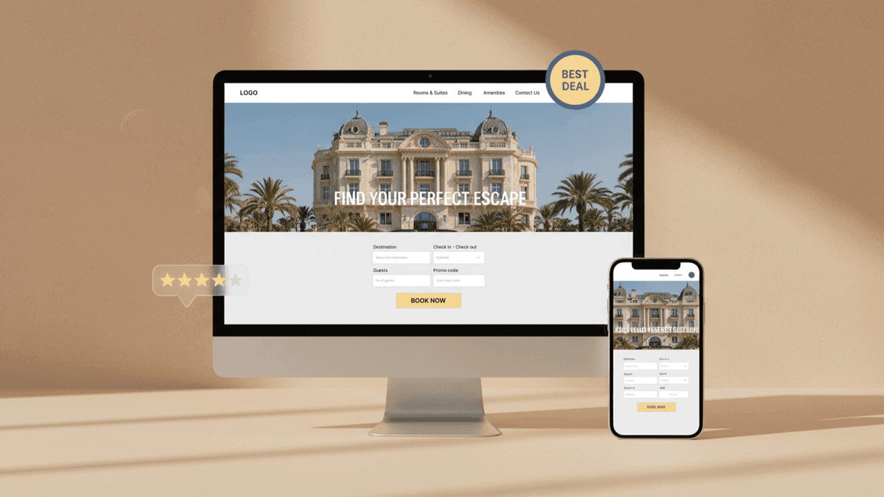
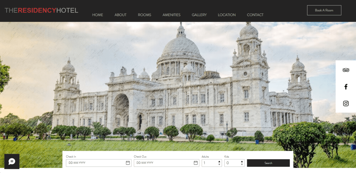
2. High-Quality, Real Images and Videos
Stock images damage trust. Guests want to see exactly what they will get.
Include:
- Real room photos
- Bathroom and amenities
- Lobby and common areas
- Dining spaces
Consistency between your website and OTA listings is crucial. Mismatched visuals create doubt and increase bounce rates.
3. Clear Pricing and Transparent Policies
Hidden charges are one of the fastest ways to lose a booking.
Make sure your website clearly displays:
- Taxes and additional fees
- Cancellation policies
- Check-in and check-out timings
Transparency reduces friction and increases confidence during checkout.
4. Secure Payment Badges and SSL Certificates
When users reach the payment stage, security becomes their top concern.
Display:
- SSL certificate (HTTPS)
- Recognisable payment icons (Visa, Mastercard, UPI)
- Secure booking messaging
These small visual cues reassure users that their financial data is safe.
5. Awards, Certifications, and Affiliations
Recognition from credible organisations adds authority.
Examples include:
- Tourism board certifications
- Star ratings
- Industry awards
Even partnerships or listings on platforms like MakeMyTrip or Airbnb can reinforce credibility.
6. Strong “About Us” and Brand Story
Guests don’t just book rooms, they connect with stories.
An effective “About Us” page should include:
- Hotel history
- Founder or management story
- Commitment to service
Adding real team photos or a short welcome message builds emotional trust and human connection.
7. Consistent Contact Information and Accessibility
A trustworthy hotel is easy to reach.
Ensure:
- Phone number is visible
- Email is professional
- Google Maps integration is accurate
Adding a physical address and directions reassures users that your hotel is legitimate.
8. Real-Time Availability and Booking Confirmation
Instant confirmation builds reliability.
A smooth booking engine that shows:
- Live availability
- Instant confirmation emails
- Booking summaries
Common Mistakes Hotels Make
Many hotel websites fail not because of design, but because of missing trust elements.
Avoid:
- Using only stock images
- Hiding policies or pricing
- No visible reviews
- Outdated content
- Broken booking systems
Even a visually appealing website cannot convert without trust.
How Trust Signals Impact Direct Bookings?
When trust signals in hotel bookings is established, users feel confident booking directly instead of going back to OTAs. This reduces commission costs and increases profit margins.
Hotels that invest in trust-building often see:
- Higher direct conversion rates
- Repeat bookings
- Stronger brand recall
Final Thoughts
Trust signals in hotel bookings is not built through one element, it is the result of multiple signals working together. From reviews and visuals to security and transparency, every detail contributes to the guest’s decision.
In a competitive hospitality market, your website must do more than look good. It must reassure, validate, and convert.
If your hotel website can answer one simple question, “Can I trust this place?”, you are already ahead of most competitors.
Read More
Turn Your Website Into a Booking Engine
Get a hotel website designed to convert visitors into direct bookings. Start with a strategy call today.