Most hotel websites look the part. Very few make the case.
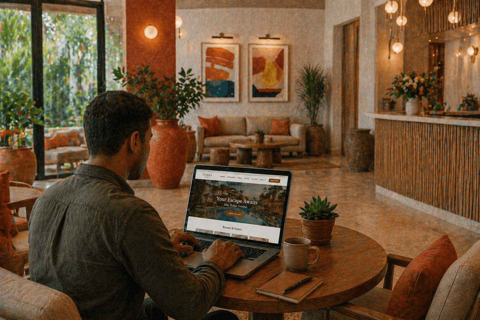
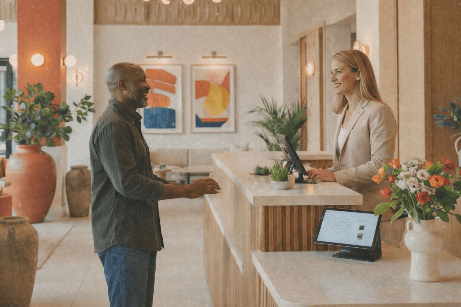
There is a version of a hotel website that does everything right, visually. Crisp photography. Clean navigation. Rooms laid out with rates and availability. A booking engine that works. On the surface, it presents the property well.
And yet, bookings are flat. Guests browse, then leave. Direct reservations sit well below where they should be, while OTA commissions quietly drain margin month after month.
The problem is rarely the design. The problem is that the website presents the hotel without positioning it.
This is the distinction that shapes everything we do at Portico WebWorks, and it’s worth understanding why it matters so much.
Agenda
This blog explores why competitive positioning, not just polished presentation, is the real driver of direct bookings for hotels. It breaks down the difference between a website that looks good and one that makes a case, examines why most hotels default to generic positioning and what it costs them, and walks through what genuine differentiation looks like in practice. It then connects positioning strategy directly to business outcomes: lower price sensitivity, better-fit guests, and reduced OTA dependency, before outlining how Portico WebWorks approaches this work with independent and boutique properties.
Presentation vs. Positioning: What’s the Difference?
Presentation answers: what does this hotel look like?
Positioning answers: why should a guest choose this hotel over the alternatives, at this rate, for this trip?
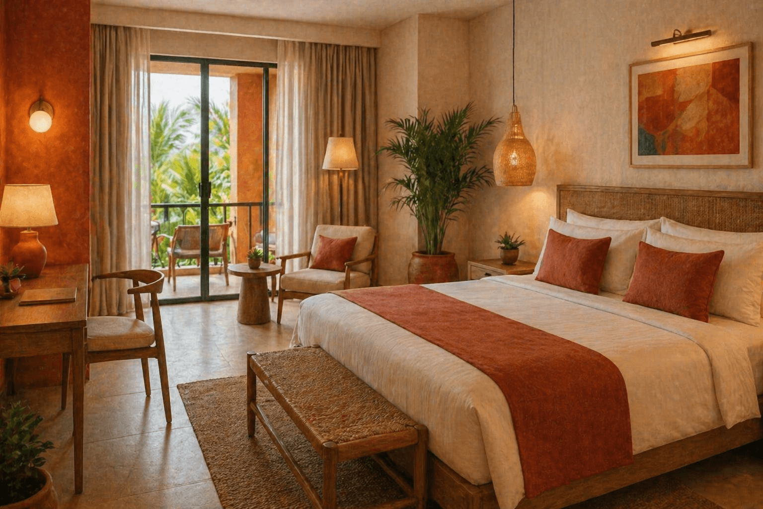
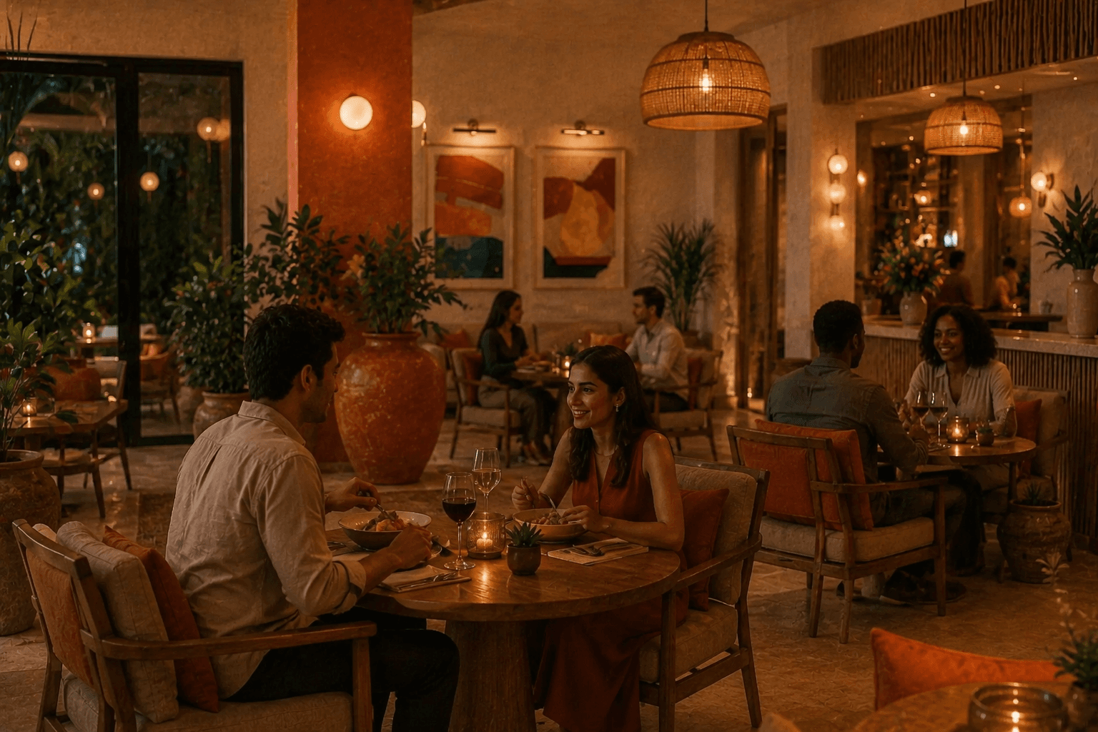
A well-presented website shows you a pool, a lobby, a room with a view. A well-positioned website makes you understand why this specific pool, in this specific location, at this specific price point, is exactly what you need.
The gap between the two is not a matter of more content or better photography. It is a matter of strategy, understanding how a hotel sits within its competitive set and making that case explicitly, honestly, and compellingly.
A well-presented hotel that is positioned identically to its competitors will attract guests based on price rather than character, and will lose those guests to a cheaper alternative.
When a website fails to differentiate, it turns every booking decision into a price comparison. Guests are not choosing your hotel, they are choosing the cheapest option that ticks their basic boxes. You have, in effect, commoditised yourself.
Why Hotels Default to Generic Positioning?
This is not a new problem, and it is not a careless one. Most hotels default to generic positioning for understandable reasons.
The first is that it feels safer. Language like “comfort, convenience, and warm hospitality” applies to almost every property in existence. It is inoffensive. It doesn’t exclude anyone. It doesn’t make a claim that could be challenged.
The second reason is that genuine differentiation requires honest self-assessment, and that is harder than it sounds. What truly separates this hotel from the one three streets away? Is it something guests actually care about? Can it be demonstrated rather than simply stated?
The third reason is that hotel owners and managers are often too close to their own property to see it clearly. What feels obvious to someone who works there every day is invisible to a first-time visitor scanning five options on a booking platform.
The result is a market where many hotels describe themselves in almost identical terms, and compete almost entirely on price.
What Genuine Differentiation Actually Looks Like?
At Portico, we spend time before we design anything trying to understand what a hotel genuinely has that its nearest competitors do not.
This is not about inventing a narrative. It is about identifying what is real and making it legible to the right guest.
Sometimes the differentiator is location, not just “centrally located” but what that location actually enables. Walking distance to the old city. A quiet pocket in a noisy destination. Views that no other property in the area can offer.
Sometimes it is character, a building with history, a family that has run the property for three generations, a design sensibility that is genuinely distinct. These things exist. Most websites bury them in an “About Us” page that nobody reads.
Sometimes it is a specific kind of service, not “personalised service” as a phrase, but an actual practice. The owner who greets every check-in. The kitchen that sources ingredients from a farm twenty kilometres away. The front desk team that has been together for a decade.
Sometimes it is a guest type. A hotel that is genuinely exceptional for business travellers, or for families with young children, or for couples on anniversary trips, has a positioning opportunity but only if the website speaks directly to that guest and makes the case for why this property is the right choice for them.
Not invented differentiation, real differences in experience, location, character, or service that exist and can be demonstrated.
The Strategic Role of a Hotel Website
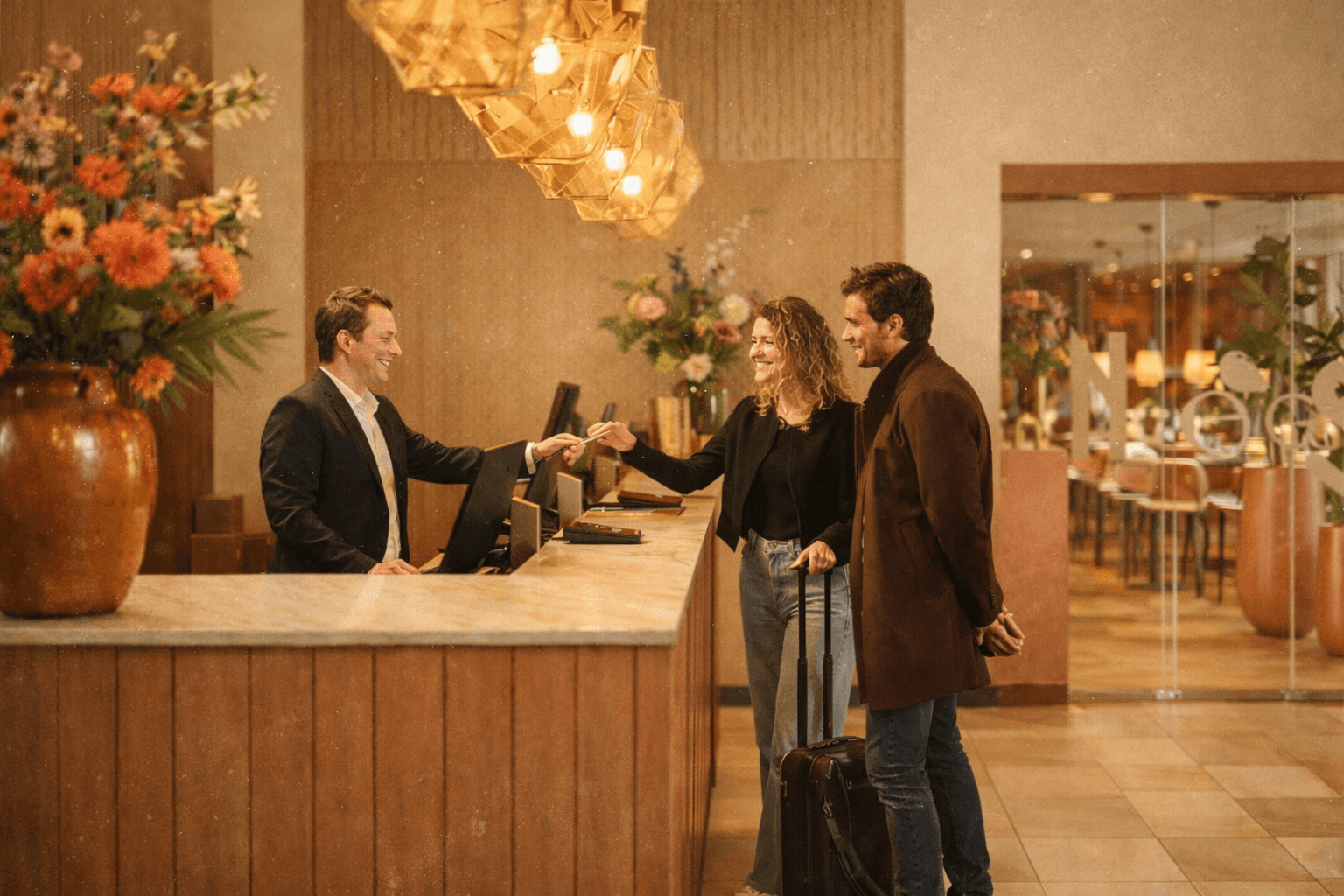
A hotel website has one commercial job: to convert a browsing guest into a direct booking at a rate they feel is justified.
That conversion does not happen through presentation alone. It happens when a guest reads the website and thinks, this is the place. This is what I was looking for. I understand why this costs what it costs, and I’m not going to find something better by checking three more options.
That response requires positioning. It requires the website to make a specific argument to a specific guest. It requires clarity about what the hotel offers, who it serves best, and why no comparable alternative delivers the same experience at this rate.
This is what we mean when we say that a hotel website should make the case for the hotel. Not a sales pitch. Not a list of amenities. A case, grounded in genuine differences, communicated with conviction, designed to reach the guest who is the right fit for the property.
What Happens When You Get This Right?
When positioning is done well, several things change.
The first is that price sensitivity drops. Guests who understand why a hotel is what it is, and who feel that the property was built for someone like them, are far less likely to leave for a cheaper alternative. The value is legible. The rate makes sense.
The second is that the right guests arrive. A well-positioned hotel attracts guests who fit the property, which means fewer complaints, better reviews, and higher repeat rates. The website has done the work of self-selection, it has spoken clearly to one guest and, by implication, politely redirected another.
The third is that the OTA dependency shrinks. When guests find a hotel through direct channels and arrive at a website that makes a compelling, differentiated case, the booking engine conversion rate improves. The commission that was leaking to OTAs stays in the hotel’s revenue.
None of this requires a larger marketing budget. It requires a clearer strategy, and a website built to execute it.
Our Approach at Portico
We work with independent hotels, boutique properties, and small chains that want their websites to do more than look good. Before we touch a design file, we work to understand the competitive set, the hotel’s genuine strengths, and the guest segment that the property is best suited to serve.
That understanding shapes every decision that follows, the messaging hierarchy, the imagery brief, the way rooms are described, where the booking engine sits in the flow, and what story the homepage tells in the first ten seconds.
The website we build is not a brochure. It is an argument. A carefully constructed case for why this hotel, at this rate, is the right choice for the guest reading it.
That is the work. And it is the work that most hotel websites have not done.
If your hotel website looks the part but isn’t converting the way it should, the answer probably isn’t more design, it’s clearer positioning.
Interested in identifying where your hotel is losing revenue? We conduct focused revenue audits for independent hotels and small chains. Book a 30-minute discovery call →